
Jack Salvador - Designer
LegalMatch is an online service that pairs member attorneys and potential clients with specific legal needs, and then provides both of these groups with case managment systems. The "attorney engagement rate" - the number of attorneys hired by clients - is the LegalMatch “north-star” KPI, followed closely by new cases filed, and new attorneys brought under contract.
My role with LegalMatch was Lead UX/UI Designer, responsible for the overall User Experience. The LegalMatch design gestalt was rapid innovation and testing across all service segments. Design collaborated constantly with Growth Lead, VP of Marketing, VP Membership, CTO, Social Media Lead, Data team, and the managing Owner/Founder.
Despite clear design wins, it was difficult to ascertain the impact of these changes on the primary KPI - the attorney engagement rate. Attorneys were hired primarily occurred off of the LegalMatch system, and despite ongoing outreach, attorneys were slow to provide information. Corrobation lagged to an unacceptable degree.
LegalMatch needed a way to get more immediate data, and a method to more directly affect the attorney engagement rate.
To expand our information, I recommended a new email/phone campaign be directed to the clients. This outreach quickly boosted our response rate for critical KPI data to over 70%, twice the rate, and three times faster, than the attorney outreach alone.
I also requested attorney engagment rate data dating back three (3) years. This historical confirmation, compared with other historical metrics, allowed us to extrapolate trends relative to the current situation.
As Lead Designer, I then requested outreach to representative attorney and client cohorts in order to ascertain satisfaction levels with LegalMatch and to gather open-ended feedback, recommendations, and requests for improvements for LegalMatch.
A wide range of methods provided quantitative and qualitative information at high return rates.
Results of the outreach were organized and provided to all members of the primary team, as well as a wider group of LegalMatch employees. Primary team members were tasked with gathering feedback from their own team members, and preparing the feedback for presentation to the primary team.
An "Ideation" meeting was implemented. Ideas were presented and evaluated using the following methods.
Responses were analyzed
Based on these initial insights, an MVP prototype was quickly created utlizing an existing calender widget. The MVP was immediately released to a limited number of users (300), of which about 1/4 had expressed interest in trying scheduling options. The other 2/3 of users would allow us to ascertain the natural adoption rate of the calendar without promotion. Also, a select group within these 300 users had agreed to provide detailed feedback for this MVP release.
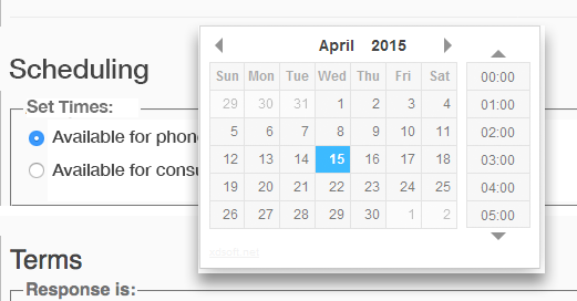
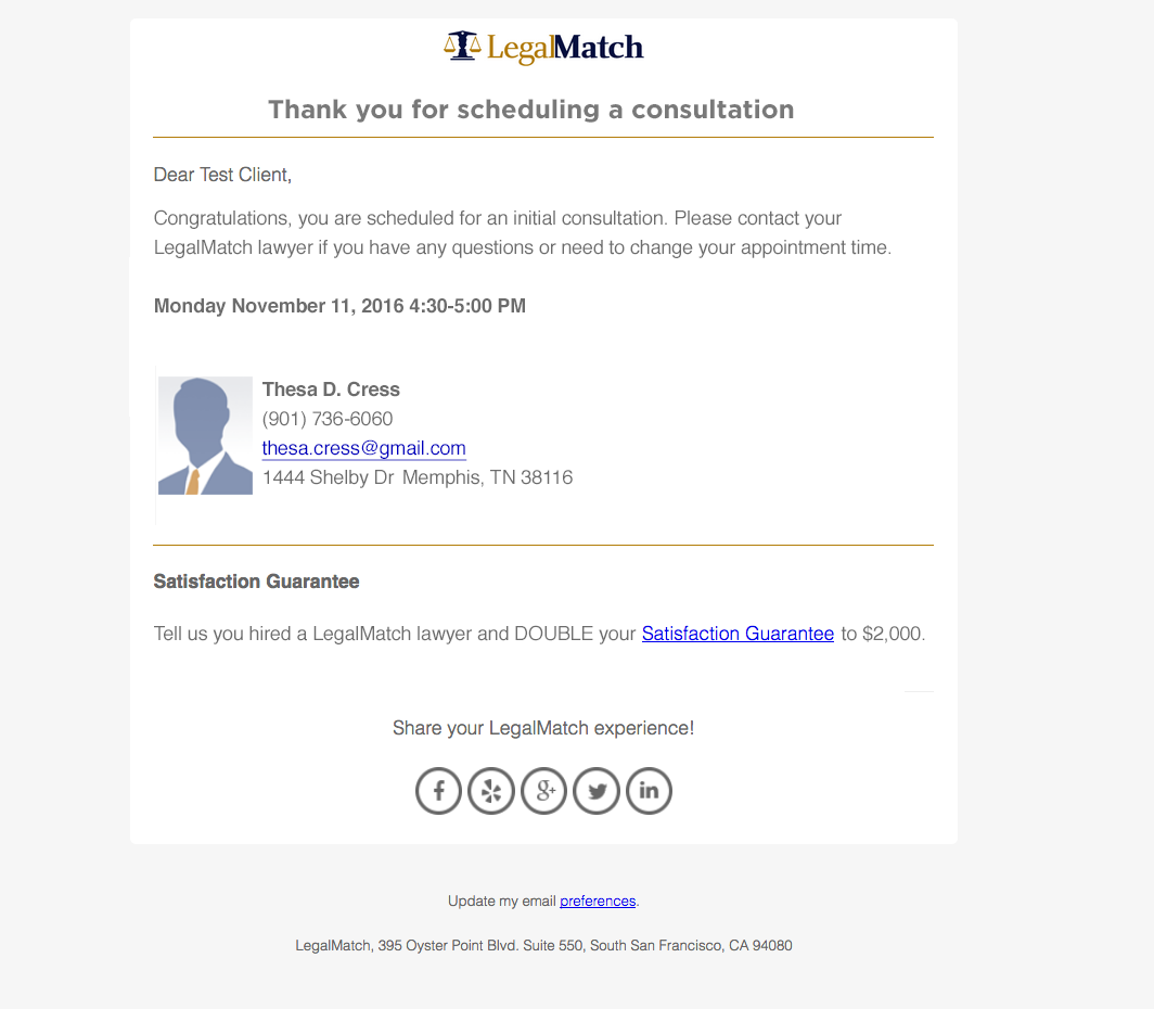
A basic email confirmation process was included with the MVP release.
Much of the heavy lifting for the Branding and Visual Design styles had been established in the previous LegalMatch project to redesign the entire web site. For the previous two years, the LegalMatch site had been a hot bed of testing. UX and UI Design, and Visual Designs were explored. Tests started with outlying site areas that had significant traffic but low impact on crtical KPIs, then circled into more signficant Landing pages, then moved to the Home page, and finally focused on the Intake Funnel.
KPIs measured in this Design testing included:
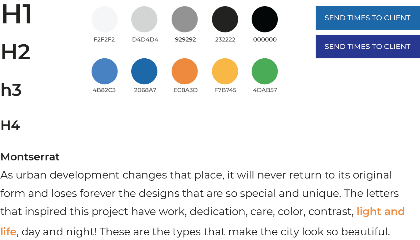
When the Calendar project begin, the basic Design Gestalt had been established:
The styles defined when the Calendar project started:
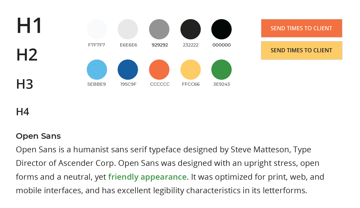
The final styles adopted site wide, including the Calendar Product interfaces:
Once actual usage data began to accrue, patterns began to emerge. For example, Calendar usage surged at the beginning of a new attorney–client cycle, and then would rapidly taper off. Feedback from the select group indicated that users wanted more insight into their scheduled times. The team had anticipated this request and had two solutions ready to test.
Solution #1: display “available” and “scheduled” times for the current case.
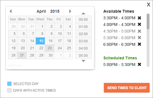
Solution #2: display “available” and “scheduled”times for all cases associated with that user, and provided case details via an info icon.

Dual Testing: both of these concepts were developed and launched for testing.
All of the intial responses were further parsed relative to case submissions, client contact, successful engagements, reported ROI, and overall site usage. Simultaneously, behavior of the test group was closely tracked, and follow up interviews and surveys were run after allowing for a conclusive cycle of activity.
Based on the data, and feedback, more ideas were generated and evaluated. Two distinct directions seemed equally viable. One, strip back the interface to limited essentails presented in incremental steps — keep it simple! Two, provide a comprehensive calendar widget with complete details and layered functionality — everything at your fingertips!
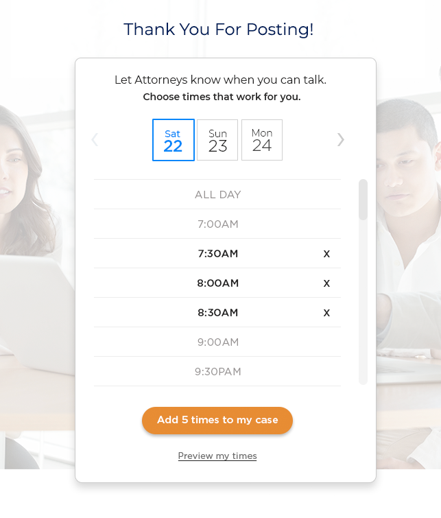
Idea #1: “Keep It Simple” — reduced to the essentail elements, presented sequentially.

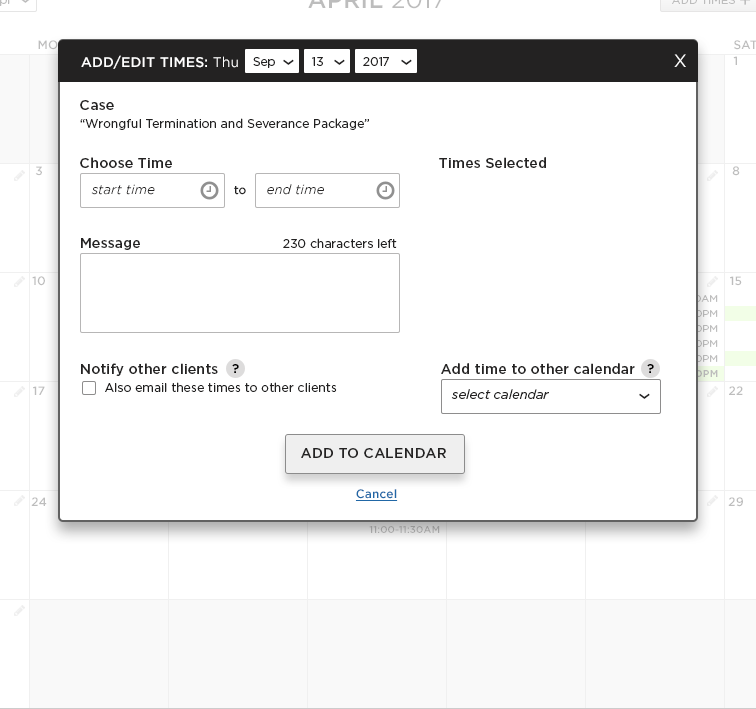
Idea #2: “Everything At Your Fingertips” — comprehensive detailed interface and functionality.
The winner — Idea #1, “Keep it Simple”. This concept won out based on prototype testing, additional data analysis, and continued feedback from users.
As user data continued to accumulate, the team created a view of the project in the data analysis tool “Looker”. With Looker, we were able to investigate granual viewpoints, and test out behavioural theories. LegalMatch data gathering programs also showed interesting trends.
What we learned is that attorneys who used the calendar feature had much higher success rates (270%), but that the window for success was very short — in fact, it was three days. Also, repeat usage and client “absenteeism ” were issues.
3-Day Focus – keep the users in a 3-day sweet spot. Make other days/times secondary.
Make the Calendar Ubiquitous – the calendar had to be everywhere – any time, any place.
Product: make “scheduling” into a full-fledged Product
Integrate: the calendar had to be everywher in the user’s interface and life cycle
Notifications: always keep users in the loop with push notifications
Promote: make users aware of the product, it’s features, and it’s success rate
Live Support: have customer support add a hands-on human touch
App: expand the product to an app focusing on scheduling to close deals
“Calendar Everywhere”: integrate scheduling throughout the attorney/client interfaces.
3-Day Calendar v1: design focusing on the 3-day “sweet spot” for success.

3-Day Calendar v2: iterative design focusing on the 3-day “sweet spot” for success.
App: scheduling was central to the app, along with notifications and varied options to immediate communicate. Since circular dates and “field of times” designs were successful in the App testing, the desktop and responsive mobile pages were also updated to these winning motifs.

The use of historic data analysis, early user feedback, prototyping, MVP products, and real-time data analysis, were all essential in helping to understand the capabilities of a scheduling feature, and lead the Team to turn the concept into a full-fledged Calendar Product.
There are some ongoing issues with client behavior, but overall, targeting clear goals with an analytical and collaborative design process made the Calendar Product a success.